Product
Announcing Precomputed Reachability Analysis in Socket
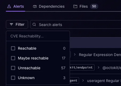
Socket’s precomputed reachability slashes false positives by flagging up to 80% of vulnerabilities as irrelevant, with no setup and instant results.
import Input from 'rc-input';
import { render } from 'react-dom';
render(<Input placeholder="input" allowClear />, mountNode);
| Property | Type | Default | Description |
|---|---|---|---|
| prefixCls | string | rc-input | |
| className | string | '' | additional class name of input |
| style | React.CSSProperties | style properties of input | |
| affixWrapperClassName | string | - | className with 'rc-input-affix-wrapper' |
| groupClassName | string | - | className with 'rc-input-group-wrapper' |
| wrapperClassName | string | - | className with 'rc-input-wrapper' |
| addonAfter | ReactNode | - | The label text displayed after (on the right side of) the input field |
| addonBefore | ReactNode | - | The label text displayed before (on the left side of) the input field |
| allowClear | boolean | { clearIcon: ReactNode } | false | If allow to remove input content with clear icon |
| bordered | boolean | true | Whether has border style |
| defaultValue | string | - | The initial input content |
| disabled | boolean | false | Whether the input is disabled |
| id | string | - | The ID for input |
| maxLength | number | - | The max length |
| showCount | boolean | { formatter: ({ value: string, count: number, maxLength?: number }) => ReactNode } | false | Whether show text count |
| prefix | ReactNode | - | The prefix icon for the Input |
| suffix | ReactNode | - | The suffix icon for the Input |
| type | string | text | The type of input, see: MDN( use Input.TextArea instead of type="textarea") |
| value | string | - | The input content value |
| onChange | function(e) | - | Callback when user input |
| onPressEnter | function(e) | - | The callback function that is triggered when Enter key is pressed |
const inputRef = useRef(null);

useEffect(() => {
  inputRef.current.focus();// the input will get focus
  inputRef.current.blur();// the input will lose focus
  console.log(inputRef.current.input);// The origin input element
}, []);
// ....
<Input ref={inputRef} />
| Property | Type | Description |
|---|---|---|
| focus | (options?: InputFocusOptions) => void | The input get focus when called |
| blur | () => void | The input loses focus when called |
| input | HTMLInputElement | null | The origin input element |
npm install
npm start
rc-input is released under the MIT license.
FAQs
React input component
The npm package rc-input receives a total of 1,532,623 weekly downloads. As such, rc-input popularity was classified as popular.
We found that rc-input demonstrated a healthy version release cadence and project activity because the last version was released less than a year ago. It has 3 open source maintainers collaborating on the project.
Did you know?

Socket for GitHub automatically highlights issues in each pull request and monitors the health of all your open source dependencies. Discover the contents of your packages and block harmful activity before you install or update your dependencies.

Product
Socket’s precomputed reachability slashes false positives by flagging up to 80% of vulnerabilities as irrelevant, with no setup and instant results.

Product
Socket is launching experimental protection for Chrome extensions, scanning for malware and risky permissions to prevent silent supply chain attacks.

Product
Add secure dependency scanning to Claude Desktop with Socket MCP, a one-click extension that keeps your coding conversations safe from malicious packages.